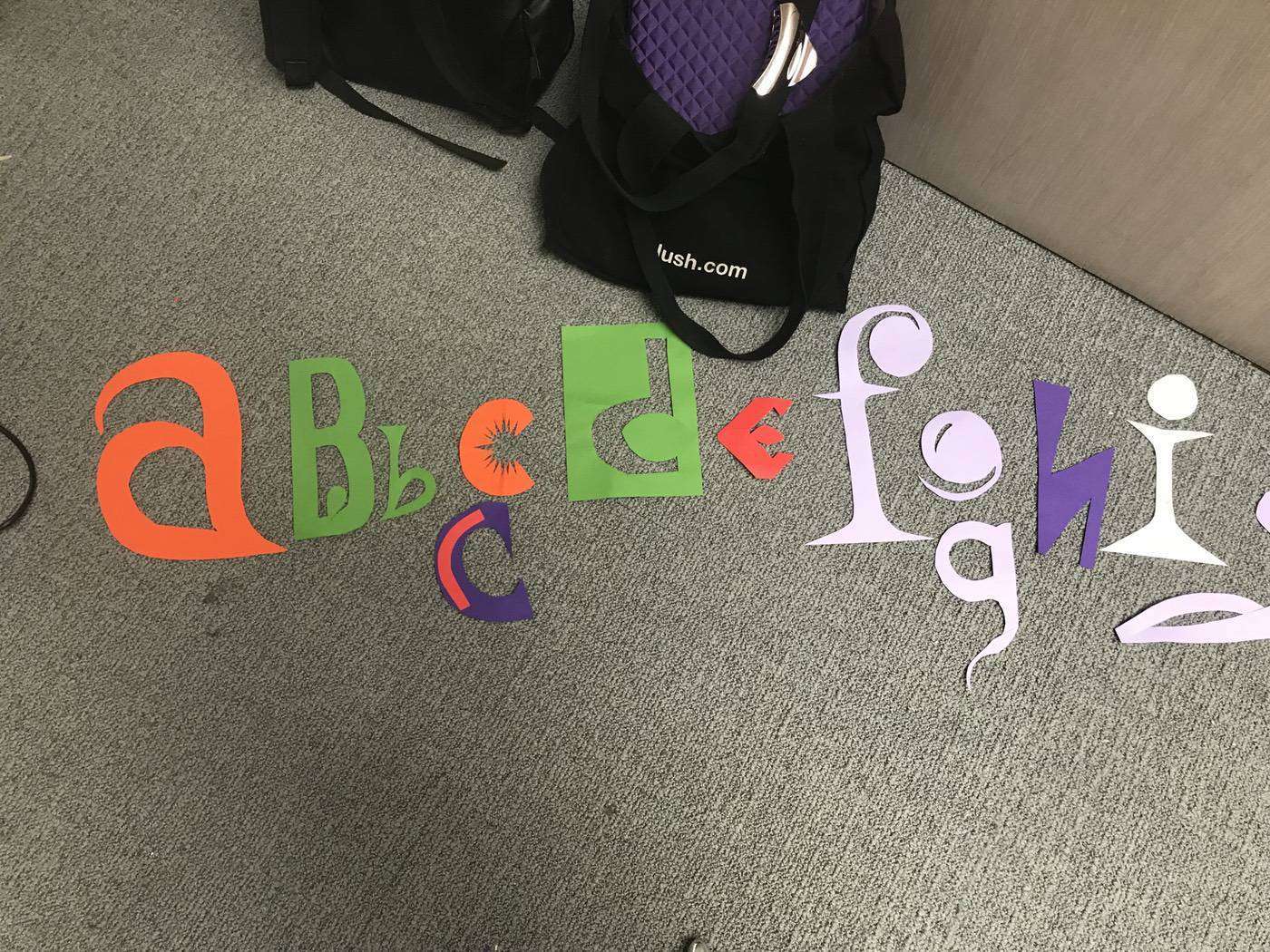
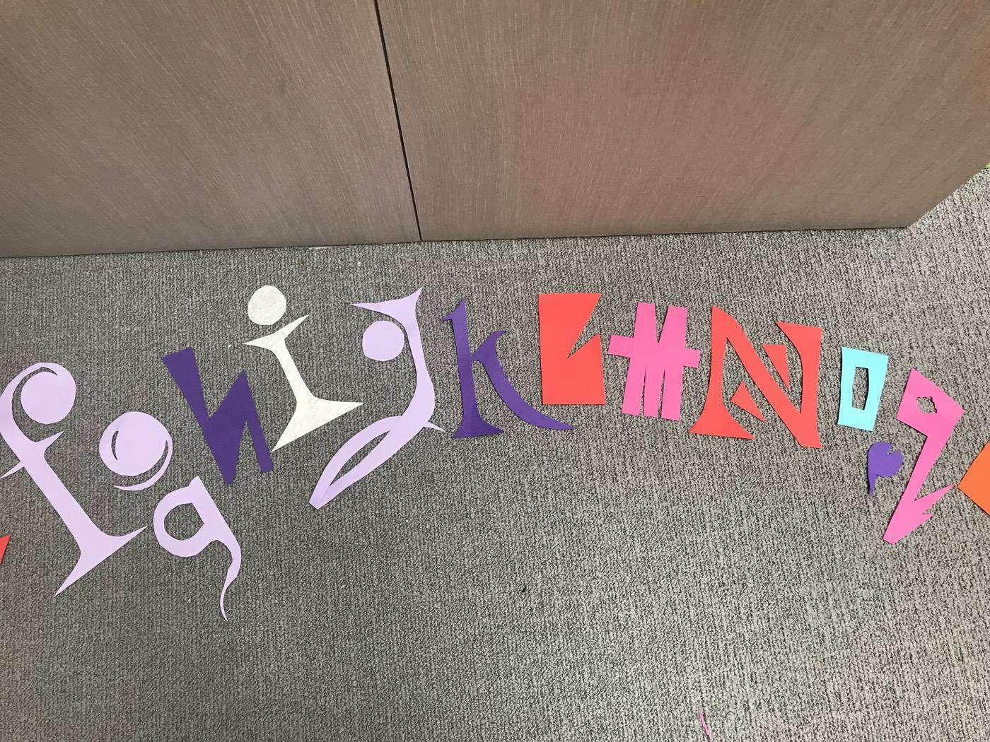
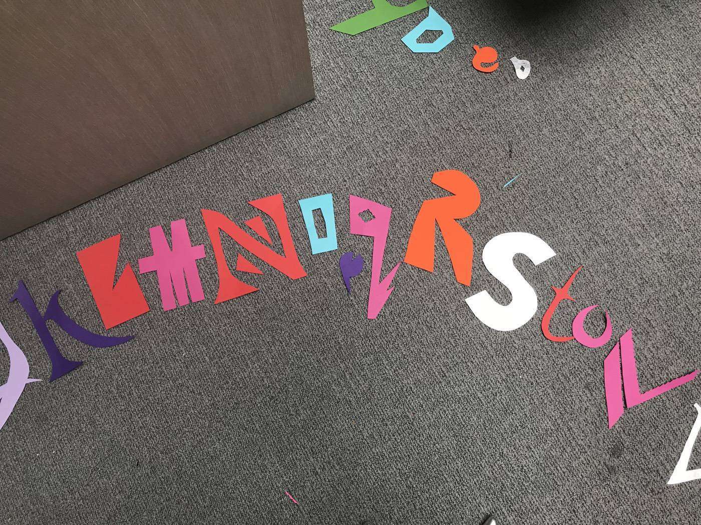
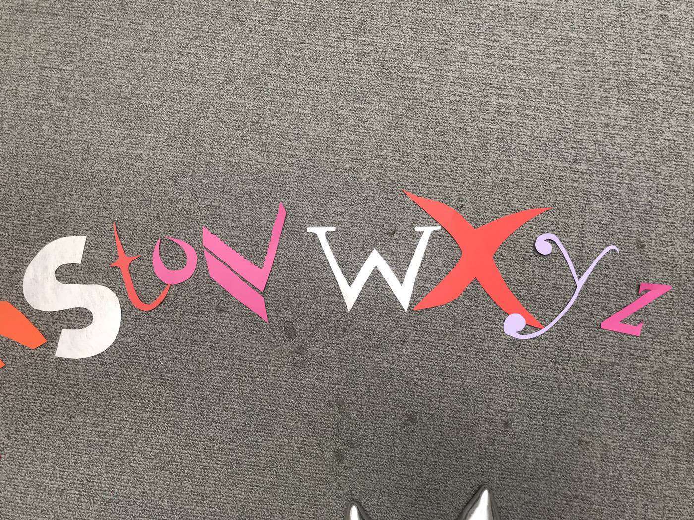
We took a class by Alexandra Lunn as part of the London Design Festival to learn to make a font just by cutting out paper. This involved many different kinds of scissors and lots of gorgeous paper courtesy of GF Smith (our favourite paper mill – can never have enough Colorplan – and we’re still going through Natalie’s reams of Plike from her uni days!) We created as many diverse styles of letters as we could think of to experience and experiment with just using scissors as a drawing tool – no pencils/pre-markings allowed!
We strongly recommend everyone should try this to really explore how you see type. It gives you the opportunity to imagine letterforms as abstract shapes rather than in context of reading and writing, but in a different way than simply drawing them would. It’s almost like life drawing with torn paper, which changes how you translate the human form to flat paper.

After we’d cut out an entire alphabet – which would never make a single font – we scanned them to font creation software Glyphs (which is incredible to use and we’ll be using to create our own fonts from now on!), and worked out there might be two or three designs here which we’d like to see the rest of the alphabet in. Which letter do you think would make a good full font?